If I had to boil multi-cloud monitoring down to one page, I’d track six things: latency, traffic, user experience, uptime, resource pressure, and cost in £. That matters because 62% of large UK organisations already use multi-cloud, and 18% are moving that way. When AWS, Azure, GCP, and private systems all report data differently, incident handling slows down.
I’d use one shared checklist for every service and region, with the same labels, units, SLI, SLO, and alert rule. That means watching P95/P99 latency, request volume and concurrency, RUM and synthetic checks, availability and failover, error rate, MTTD, MTTR, and error budget burn, plus CPU, memory, saturation, autoscaling, and monthly spend in £. The point is simple: if a metric has no owner and no alert threshold, it won’t help when something goes wrong.
Here’s the short version:
- Performance: track P95 and P99 latency, throughput, concurrency, and user journeys
- Reliability: measure end-to-end uptime, failover time, failover success, and user-visible errors
- Incident handling: monitor MTTD, MTTR, and error budget burn
- Capacity: watch CPU, memory, storage, network, and saturation
- Cost: link usage to cost per service, cost per 1,000 requests, and idle spend
- Consistency: use the same labels such as
cloud_provider,region,service_name,environment, andteam - Time and money: report in Europe/London time and show spend in £
A few numbers stand out. I’d start with P95 under 200 ms for UK UI endpoints, P99 under 500 ms for APIs, 99.9%–99.95% quarterly availability, and a user-facing error alert at over 2% for 5 minutes. For capacity, I’d warn at over 75% utilisation for 10 minutes and mark it critical at over 90% for 5 minutes.
| Area | What I’d measure | Starting point |
|---|---|---|
| Speed | P95, P99, P99.9 latency | <200 ms, <500 ms, <1,000 ms |
| Demand | RPS, sessions, concurrency, bandwidth | Split by cloud, region, service tier |
| User view | RUM, Core Web Vitals, synthetic checks | Test login, search, checkout every 1–5 mins |
| Availability | Uptime, failover time, failover success | 99.9%–99.95%; <60 sec stateless |
| Errors | User-visible failures, dependency failures | Alert at >2% for 5+ mins |
| Team response | MTTD, MTTR, burn rate | 5–10 mins MTTD; 30–60 mins MTTR |
| Capacity | CPU, memory, disk, network, saturation | Warn >75%; critical >90% |
| Spend | Cost per service, per request, idle cost | Review weekly and on spikes |
My view: multi-cloud monitoring only works when every service is measured the same way across every cloud. Once that is in place, you can compare performance, spot faults faster, and tie technical issues back to lost revenue and wasted spend.
::: @figure 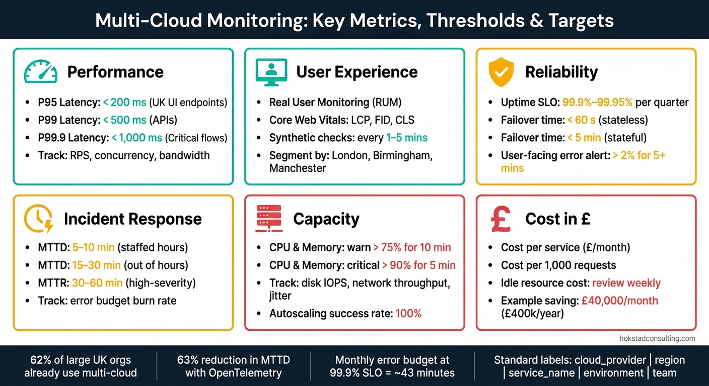 {Multi-Cloud Monitoring: Key Metrics, Thresholds & Targets at a Glance}
:::
{Multi-Cloud Monitoring: Key Metrics, Thresholds & Targets at a Glance}
:::
Performance metrics: latency, traffic and user experience
Track response time with P95 and P99 latency
Average latency can look fine while users are still hitting slow responses. That’s why P95 and P99 percentiles should be the default view in any multi-cloud monitoring checklist.
In a multi-cloud setup, measure latency across the full request path, including cross-cloud calls. A slow path between clouds can push up P99 even when nearby services seem healthy. It also helps to track successful and failed requests separately. A fast error is still a bad user experience.[3][4]
Use these starting thresholds as baseline alert points.[9]
| Metric | Starting target | Use for |
|---|---|---|
| P95 latency | < 200 ms | UK UI endpoints |
| P99 latency | < 500 ms | APIs |
| P99.9 latency | < 1,000 ms | Critical flows |
Alert when P99 stays above your SLO threshold for more than two minutes.[5]
Measure throughput, request volume and concurrency
Once you can see latency clearly, the next step is figuring out what’s behind it. Is demand rising, or are requests stuck in a queue?
Track RPS, active sessions and bandwidth for each critical path. Split the data by provider, region and service tier, such as API gateway, core microservices, data services, and edge or CDN.
One simple rule helps here: Little's Law. Concurrency = throughput × latency. At 100 RPS with an average latency of 0.5 seconds, you have about 50 concurrent requests in flight.[2] If concurrency goes up without the same jump in RPS, requests are often queuing. In many cases, that points to a downstream service in another cloud slowing things down. Matching autoscaling policies to business-hour peaks in UK local time (Europe/London), rather than UTC averages, can help avoid unnecessary degradation during the working day.
Monitor real user and synthetic experience
Backend metrics only tell part of the story. You also need a user-facing check.
Real User Monitoring (RUM) shows what people on real devices go through: page load time, Core Web Vitals like Largest Contentful Paint, First Input Delay and Cumulative Layout Shift, plus client-side error rates. Segment RUM data by UK location, such as London, Birmingham and Manchester, and by the backend provider and region handling those requests. That can bring routing differences between clouds and regions into view.[6][7]
When RUM data is thin, synthetic checks help fill the gap. Run synthetic checks for login, search and checkout from UK vantage points every one to five minutes. If P95 synthetic latency starts climbing or success rate drops, you may be seeing routing issues before users report them.[1][8]
Reliability metrics: uptime, errors and incident response
Measure uptime and failover performance
After latency and user experience, the next thing to check is simple: does the service stay up when a cloud or region goes down?
That means measuring end-to-end user availability, not just whether an internal component is alive. Can users still complete key journeys across clouds and regions when something fails?
Use %Availability = ((Total Time – Total Downtime) / Total Time) × 100 for each service, provider and critical region. Set quarterly SLOs at 99.9%–99.95%.[11]
Failover needs its own tracking too. Measure failover time and failover success rate as separate signals. A backup path that exists on paper but fails during a live switch is no help at all. Set failover targets at under 60 seconds for stateless services and within five minutes for stateful services. Then test those targets in game days.[11]
Watch error rates by service, region and provider
Not every error means the same thing, so split them clearly. Separate customer-impacting failures from retried failures.
For example, alerting on a sustained checkout failure rate above 2% for five minutes lines up with what users are actually feeling, rather than just what the system logs happen to show.[12]
Tag errors with user_visible=true or false, plus a journey label such as checkout. Add cloud and region labels as well, so dashboards can show whether a spike is stuck in one provider or starting to spread. It also helps to track unhandled application exceptions and provider-related dependency failures as separate signals, such as managed database throttling or storage outages.[11]
Track MTTD, MTTR and error budget burn
Availability numbers on their own don't tell the whole story. They matter far more when paired with how fast teams spot a problem and how fast they fix it.
Track MTTD, MTTR and error budget burn by service, region and provider. Use MTTD targets of 5–10 minutes in hours and 15–30 minutes out of hours. Use MTTR targets of 30–60 minutes for high-severity incidents, and use post-incident reviews to bring that figure down over time.[10]
Error budget burn rate pulls these signals together. If burn is running ahead of plan, slow high-risk releases and put the focus back on stability until reliability improves.
| Metric | Purpose | Practical target |
|---|---|---|
| End-to-end uptime | Can users complete key journeys? | 99.9%–99.95% per quarter |
| Failover time | How fast traffic shifts to a backup | < 60 s (stateless), < 5 min (stateful) |
| User-facing error rate | Share of requests that fail visibly | Alert if > 2% for 5+ minutes |
| MTTD | How fast the team spots an incident | 5–10 min (staffed), 15–30 min (out of hours) |
| MTTR | How fast service is restored | 30–60 min (high-severity) |
| Error budget burn | How much reliability headroom remains | Review when burn is ahead of plan |
Resource and cost metrics: utilisation, saturation and £ impact
Track compute, memory, storage and network usage
After reliability, the next step is simple: check whether the platform matches actual demand. The main signals to watch are CPU utilisation, memory utilisation, disk IOPS, storage latency, network throughput, packet loss and jitter.[16]
CPU usage often gives the first clue. If it stays high for long periods, you're likely under-provisioned. If it stays low across a whole fleet, you're probably paying for more capacity than you need.[16] Memory tells much the same story. When usage starts pushing towards 90%, the risk of swapping and out-of-memory crashes goes up. On the other hand, if there's loads of spare memory all the time, the instance tier may be too big.
Autoscaling matters too. Track both autoscaling time and scaling success rate. If scale-out is slow or fails, traffic spikes can hit before the platform has room to cope.[13][14]
Measure saturation and capacity headroom
Utilisation shows how much of a resource is being used. Saturation shows how close that resource is to its limit. That's an important difference, because saturation often shows up before errors or slow response times.[15]
It helps to treat saturation as a main signal alongside latency, traffic and errors. Track used versus provisioned capacity across instances, containers, databases, message queues and load balancers. That gives you an early warning when headroom is shrinking, before users feel the pain.
A practical alerting setup is:
- Warn at >75% utilisation sustained for 10 minutes
- Mark it critical at >90% for 5 minutes[5]
Link usage to cloud spend in GBP
Cost metrics turn raw usage into something teams can act on. The most useful ones are cost per service, cost per request, idle resource cost and unused-capacity spend. For cost per request, add up the infrastructure spend for a service over a set period, divide it by transaction volume, and then compare using cost per 1,000 requests.[17] Idle resource cost includes stopped instances, unattached volumes and oversized databases.[17]
This is where the money story becomes hard to ignore. BT's EE division saved £40,000 per month, adding up to £400,000 in one year, through continuous monitoring, rightsizing and optimisation.[18] If your dashboards don't show idle spend and cost-per-service figures, that kind of saving is easy to miss.
| Metric | Unit | Why it matters | Typical threshold |
|---|---|---|---|
| CPU utilisation | % | Flags under-provisioning or idle waste | Warn at >75% for 10 minutes; critical at >90% for 5 minutes |
| Memory utilisation | % | Prevents swapping and OOM crashes | Keep below 90% |
| Disk IOPS | IOPS | Measures storage processing speed | Track against provisioned limits |
| Storage latency | ms | High latency indicates storage bottlenecks | Track against baseline |
| Network throughput | Mbps/Gbps | Tracks data volume against capacity | Compare with expected workload |
| Packet loss | % | Measures network reliability | Track against baseline |
| Jitter | ms | Stability for real-time applications | Track against baseline |
| Autoscaling time | s | Confirms infrastructure responds to demand | Track per scale event |
| Scaling success rate | % | Ensures scale-out completes without errors | 100% |
| Cost per service | £/month | Identifies the most expensive components | Review on cost spikes |
| Cost per request | £/request | Links traffic volume to spend; use cost per 1,000 requests for comparison | Track trend over time |
| Idle resource cost | £/month | Quantifies waste from unused capacity | Review weekly |
| Spend on unused capacity | £/month | Measures financial impact of over-provisioning | Minimise |
Standardisation and conclusion: turning metrics into action
Normalise metrics, labels and alert rules across clouds
Once you've set latency, uptime and cost metrics, the next step is to make sure every cloud reports them in the same way. If metric names, units and labels differ from one platform to another, dashboards get messy and alerts become hard to trust.
Use the same labels in every environment: cloud_provider, region, service_name, environment, team.
Use OpenTelemetry as a vendor-neutral pipeline for metrics and traces across AWS, Azure, GCP and on-premises. A study of multi-cloud engineering teams found it cut mean time to incident diagnosis by 63%.[19][20] Run OTel Collectors as a standard pipeline and send telemetry to one observability backend. That gives you one place to compare service health and trace latency, instead of jumping between tools.
Build a short checklist for every critical service
When metrics line up across clouds, boil each critical service down to one shared ownership and alert page. The goal is simple: anyone looking at that page should know what good looks like, what bad looks like, and who needs to respond.
Each critical service should have:
- a latency target (P95 or P99 in milliseconds)
- an uptime target (such as 99.9% or 99.95%)
- an error-rate threshold (for example, warn at 1%, critical at 2%)
- a resource saturation limit
- a monthly cost view in £
- a named alert owner with an escalation path
Use one shared SLI, SLO and alert rule set for every critical service. For a 99.9% availability SLO, the monthly error budget is about 43 minutes.[21] Burn-rate alerts help here. They let warning alerts fire early, while critical alerts trigger before the SLO is missed.
Conclusion: the metrics that matter most
Across performance, reliability and cost, the idea is the same: track in a consistent way, report against commitments, and act on what the data shows. Latency percentiles, uptime, error rates, utilisation, saturation and £ spend all matter. But they only help if they're measured the same way across every cloud and owned by someone who can do something about them.
If you need help standardising observability and cloud cost visibility across environments, Hokstad Consulting can help.
Simplifying Multi-Cloud Observability | Software Architecture Conference
FAQs
Which metrics should we standardise first?
Start with the four Golden Signals: latency, traffic, errors, and saturation. They give you the clearest view of system health and the user experience across multi-cloud environments.
Use a single schema for these metrics. That means tracking things like request duration, error counts, and resource usage such as CPU and memory in the same way across systems.
Then set shared performance baselines for throughput and availability. This helps teams measure services on the same terms and keeps day-to-day operations consistent and reliable.
How do I set realistic multi-cloud alert thresholds?
Set thresholds from past baselines so “normal” performance is based on what your system has actually done, not on made-up numbers. Use SLOs to guide alerting, and pay close attention to tail latency at p95 and p99 instead of leaning on averages, which can hide trouble.
Split alerts by region so they match provider-specific behaviour. That matters when one area starts acting up while others stay steady. For resource saturation, common trigger points are 80% CPU and 85–90% memory. It also helps to deduplicate alerts so teams aren’t hit by the same signal again and again.
How can I link performance issues to cloud spend?
Correlate technical metrics with financial data in one observability platform. When you track CPU utilisation, memory consumption, and slow database queries, it becomes much easier to spot underused resources or inefficient code that push costs up.
A clear tagging strategy by workload, team, or environment helps you produce cost reports in pounds sterling (£) and link performance bottlenecks to specific budget lines. That makes rightsizing and code optimisation far more practical, because you can see where spend is drifting and which systems are behind it.