
Data transfer is often where cloud spend slips out of view. In many estates, it can make up around 10% of total cloud spend, yet it gets mixed into general infrastructure lines and missed in monthly reviews.
If I were setting up reporting, I’d keep it simple from day one:
- Split transfer spend into clear categories: ingress, internet egress, inter-zone, inter-region, CDN, and shared network services like NAT and load balancers
- Normalise provider labels into one model so AWS, Azure and Google Cloud can be compared in the same report
- Convert all figures into £ using one exchange-rate rule
- Track three base metrics for each route, provider and workload:
- total GB/TB
- total £ spend
- cost per GB
- Add business metrics such as:
- cost per transaction
- cost per API call
- cost per active user
- data transfer as a % of total cloud spend
- Use billing data with flow logs and tags so you can tie spend back to teams, apps and environments
- Review patterns monthly to spot cross-region traffic, cross-zone service calls, and NAT processing fees that do not match demand
Here’s the short version: if you only report a single networking total, you miss what is driving the bill. If you break charges out by route, provider and workload, you can see whether spend comes from growth, poor service placement, replication, logging traffic, or public paths that should stay private.
A few figures in the article stand out:
- AWS and Google Cloud charge for cross-zone traffic in both directions
- Azure removed inter-zone charges in May 2024
- One cited Q1 2025 analysis found that nearly 90% of AWS data transfer spend sat in just two line items
- Putting chatty services in the same availability zone can cut some cross-zone costs by around 70%
The core message is plain: separate transfer costs, map them into one taxonomy, report both usage and £ by route, then link that spend to business activity. That gives finance, engineering and product teams a view they can act on.
Cloud Data Transfer Costs Explained | Optimizing Egress & Cross-Region Traffic
How cloud providers charge for data transfer
::: @figure 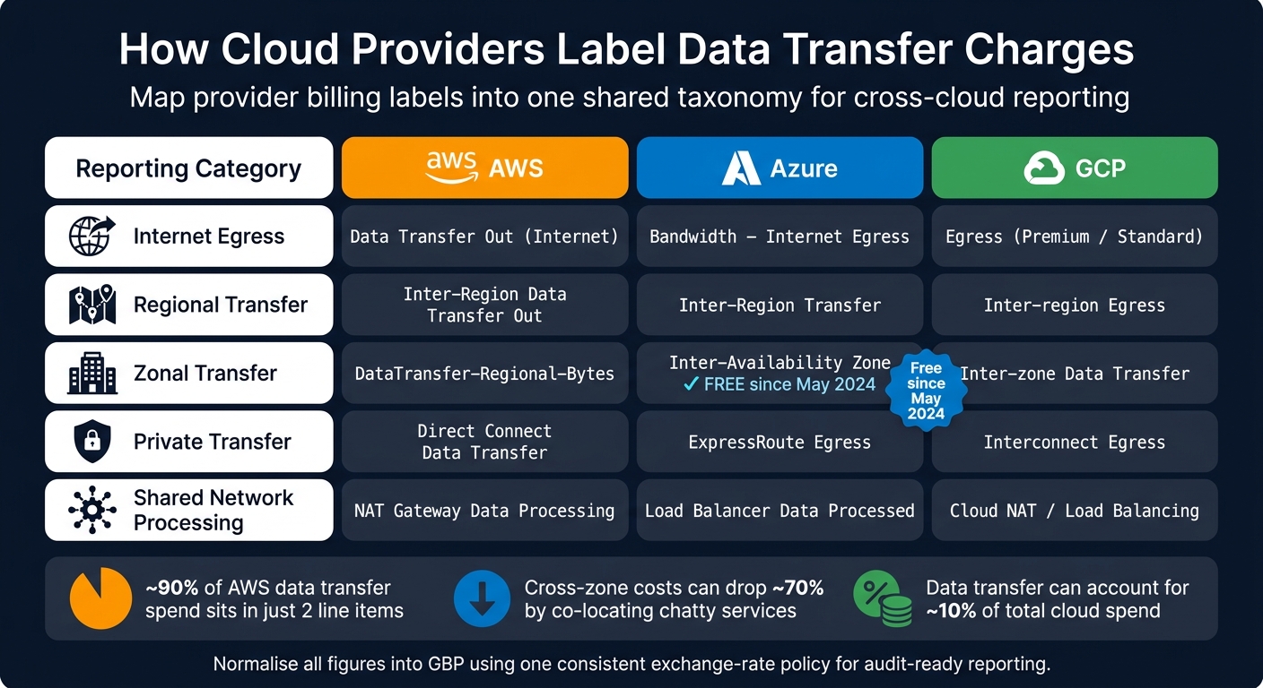 {Cloud Provider Data Transfer Pricing: AWS vs Azure vs GCP Reporting Categories}
:::
{Cloud Provider Data Transfer Pricing: AWS vs Azure vs GCP Reporting Categories}
:::
AWS, Azure and Google Cloud all charge for data movement on a per-GB, route-based model. In plain English, the price depends on the path the data takes: where it starts, where it ends, and which network boundary it crosses.
That matters more than memorising exact prices. Rates change often, and they vary by route and region. So the smarter approach is to understand the billing logic first. Those routes also set the reporting dimensions used across this guide.
The pricing routes that most often drive spend
Providers charge by route, which means reporting needs to group those route-based costs in a consistent way. In most cases, the routes that drive the biggest share of spend are internet egress, inter-zone transfer and inter-region transfer.
Internet egress is traffic leaving a provider’s network and going to the public internet. If data moves from one cloud to another, the sending provider will usually bill it as internet egress.[1][5]
Inter-zone transfer is traffic moving between availability zones in the same region. AWS and Google Cloud charge for cross-zone traffic in both directions, so a request and its response can both be billed. Azure dropped inter-zone charges in May 2024, which means cross-zone traffic inside a region is now free.[4][6]
Inter-region transfer covers data moving between separate geographic regions, such as London to Dublin. This is usually priced higher than traffic that stays within one region. You’ll often see it tied to replication, disaster recovery and analytics pipelines.[2][3]
Mapping provider billing into a single reporting taxonomy
Each provider names these charges in its own way. AWS uses line items such as DataTransfer-Regional-Bytes, Azure uses labels such as Bandwidth - Internet Egress, and Google Cloud splits some outbound traffic across Premium and Standard egress tiers. Those labels don’t line up neatly, which makes month-on-month comparison across a mixed estate awkward unless you normalise the data first.
Without that normalisation step, cross-cloud cost metrics are hard to compare.
A practical reporting model is to map every provider line item into five shared categories:
- internet egress
- regional transfer
- zonal transfer
- private transfer
- shared network processing
Private transfer covers traffic over Direct Connect, ExpressRoute or Interconnect. These services come with their own processing fees, so they should sit apart from public egress. That makes it easier to judge whether the extra spend is worth it for compliance or performance needs.
Shared network processing covers charges from managed network services such as NAT gateways and load balancers. These are separate from the main transfer routes, so if you lump them together, the picture gets muddy fast.
For UK finance teams, all amounts should be normalised into GBP before reporting. Use one exchange-rate policy and stick to it, whether that’s spot, monthly average or the rate used by your finance system. It keeps the numbers fit for audit and makes variance analysis much cleaner.
Once every charge sits in one shared category, provider comparisons start to make sense.
Comparison table: provider pricing dimensions and reporting categories
| Provider Charge Type | AWS Label | Azure Label | GCP Label | Reporting Category |
|---|---|---|---|---|
| Internet egress | Data Transfer Out (Internet) |
Bandwidth - Internet Egress |
Egress (Premium/Standard) |
Internet Egress |
| Inter-region transfer | Inter-Region Data Transfer Out |
Inter-Region Transfer |
Inter-region Egress |
Regional Transfer |
| Inter-zone transfer | DataTransfer-Regional-Bytes |
Inter-Availability Zone |
Inter-zone Data Transfer |
Zonal Transfer |
| Private connectivity | Direct Connect Data Transfer |
ExpressRoute Egress |
Interconnect Egress |
Private Transfer |
| Managed network services | NAT Gateway Data Processing |
Load Balancer Data Processed |
Cloud NAT / Load Balancing |
Shared Network Processing |
That shared structure makes the key metrics in the next section comparable across providers, routes and workloads.
Key metrics to include in data transfer cost reports
Volume and cost metrics by route, provider and workload
Once your billing data sits inside one shared taxonomy, the next job is simple: decide what you’ll measure every month.
For each provider, route and workload, track these three figures:
- Total volume transferred in GB or TB
- Total spend in £
- Effective cost per GB = total spend ÷ total GB
Keep those figures in one reporting view for each provider, route and workload. That gives you a clean way to compare routes before you move into business-facing efficiency measures.
Track volume and per-GB cost side by side. That’s how you tell the difference between more demand and more expensive routing. If spend goes up but GB hardly moves, the issue is usually route mix rather than demand.[9][13]
Report these routes separately using the shared taxonomy above.
Efficiency and allocation metrics for business reporting
Once volume and spend are visible, the next step is to translate them into measures the business can use. The most useful ones link transfer spend to actual business activity.
- Cost per transaction: workload-level transfer spend divided by completed business events. If a UK e-commerce workload spends £4,000.00 on data transfer and processes 200,000 orders, the cost per transaction is £0.02. If that figure climbs without much change in order volume, it often points to a checkout flow that uses more network traffic.[10][11]
- Cost per API call: transfer spend divided by total calls. A microservice with £1,200.00 in data transfer and 30 million calls comes out at roughly £0.00004 per call. That helps flag APIs that send oversized payloads or make needless round trips.[10]
- Cost per active user: a UK SaaS product spending £7,500.00 on transfer for 50,000 active users works out at £0.15 per user per month. If the user base stays flat, this number is worth watching closely.[10][12]
Alongside those unit measures, every report should show data transfer as a percentage of total cloud spend, calculated at product, environment and business unit level. For example, a fintech product spending £12,000.00 of a £60,000.00 monthly cloud bill on data transfer is running at 20%. That can be a sign of network-heavy products eating into margin. Production may carry a higher share than development, while high percentages in staging or other non-production environments can point to wasteful test setups or shared staging systems moving large datasets for no good reason.[8][12]
Metrics-to-use-case table for reporting decisions
Use this map to match the right metric to the right reporting need.
| Metric | Question it answers |
|---|---|
| Total GB/TB by route and provider | Which paths carry the most traffic each month? |
| Total £ by route and provider | Where does network spend concentrate? |
| Effective cost per GB by route | Which paths are most expensive per unit of data? |
| Month-on-month change in £ and GB | Is a cost increase driven by more traffic or more expensive routing? |
| Data transfer £ as % of total cloud spend (by product, environment, business unit) | Where are network-heavy products reducing margin? |
| Cost per transaction | Is the cost of serving a single business event increasing due to network behaviour? |
| Cost per API call | Which APIs are least efficient from a bandwidth perspective? |
| Cost per active user | How much network spend is associated with each user, and is it sustainable? |
| Cost per dataset processed | Are analytics pipelines moving more data than necessary? |
Each metric comes straight from billing exports and tagged resource data. One detail from live billing data stands out: Vantage's Q1 2025 cloud cost analysis found that nearly 90% of AWS data transfer spend sat in just two line items - DataTransfer-Out-Bytes at 45% and DataTransfer-Regional-Bytes at 43%.[14]
Building reports that support cost reduction
Data sources, tagging and dashboard structure
Start with billing exports and flow logs. Then build three reporting layers: provider, route and workload.
On AWS, turn on the Cost and Usage Report (CUR) to S3 and use Cost Explorer to review trends. On Google Cloud, send billing data to BigQuery; rows usually appear within about four hours and include SKU, resource and label fields.[18] On Azure, pull cost exports straight from Cost Management.
Billing data on its own won't tell you why the charges appeared. You need to pair it with VPC Flow Logs or similar flow-logging tools, stored in tables you can query, so you can match traffic patterns with spend.[16][21]
Tag resources with Application, Environment (Production, Staging, Development), Team, Service and Cost centre or Business unit, then switch those fields on as allocation tags or labels.[15][19][20] If tagging isn't done at provisioning time, spend ends up unallocated. That makes chargeback messy and cost cutting much harder.
Report formats for provider, route and workload views
Build dashboards in layers, with each one aimed at a different group.
Provider-level monthly summaries are for finance controllers and leadership. They should show total data transfer spend by cloud provider, transfer volume, month-on-month change in both £ and percentage terms, and the top five routes or services behind the spend. Just as important, keep transfer spend separate from compute, storage and support charges so finance teams don't mistake network movement for general cloud growth.[17]
Route-level breakdowns are for infrastructure teams. Filter CUR or BigQuery data by usage type groups such as Internet (Out), inter-Availability Zone and Region-to-Region (Out), or by specific network charges such as NAT gateway processing. Then group by region, service and environment.[17][7] This is where needless cross-region or cross-AZ traffic starts to stand out.
Workload-level dashboards are for engineering teams and product owners. Group costs by Application, Team, Environment or Service to show which workloads drive transfer spend, and combine that with traffic data from flow logs. Add trend lines across three to six months so teams can see whether a fix cut spend or simply shifted it somewhere else.[21] When dev or staging racks up heavy transfer costs, that's usually a sign of waste.
Comparison table: provider-centric, route-centric and workload-centric reports
| Report structure | Strengths | Weaknesses | Best-fit use case |
|---|---|---|---|
| Provider-centric | High-level budget tracking; easy to reconcile with invoices | Lacks technical detail on what is driving spend | Finance and leadership monthly reviews; budget governance |
| Route-centric | Identifies architectural waste such as high NAT or cross-AZ fees | Hard to attribute costs back to specific products or teams | Infrastructure audits and network optimisation projects |
| Workload-centric | Shows the true cost of a service; encourages team accountability | Requires mature tagging and consistent data mapping | Unit economics, internal showback and chargeback |
Use provider views for governance, route views to spot waste, and workload views to pin costs to the teams and services behind them.
Using reported metrics to cut costs and improve governance
The cost patterns these metrics typically reveal
Inter-region, zonal and NAT charges tend to point to the same core problems.
High inter-region GB often means cross-region replication was set up for resilience and then left alone, with no later cost review. Heavy cross-AZ traffic usually shows that high-traffic services are talking to each other too often across zones. In many cases, putting those chatty services in the same availability zone can cut egress costs by around 70%[22].
Large NAT gateway data processing charges are another common warning sign. They often show that traffic is taking a public route that could be avoided. In practice, that traffic can often be moved to private endpoints or similar private connectivity instead.
Observability pipelines can also drive a lot of spend. Logs, metrics and traces sent to another region or to an external observability platform can rack up hefty transfer charges. This often shows up as a spike in internet egress or inter-region GB tied to one monitoring or logging service. At that point, the next step is clear: allocate those costs at workload level.
Efficiency metrics help fill in the rest of the picture. If GB per job goes up while request volume stays flat, the issue is unlikely to be simple growth. More often, the system is reprocessing data or sending payloads that are bigger than they need to be.
How UK organisations can put reporting into practice
These patterns should lead to monthly action, not just a neat report.
A good starting point is a monthly review of data transfer spend in £, along with threshold alerts for categories like cross-region GB and NAT processing charges. Shared network costs should also be allocated to product or team owners, so each team can see the cost created by its own service traffic. That way, odd spikes are spotted early instead of turning up at month end.
Dashboards help, but ownership matters just as much. When a team is accountable for the transfer costs its service creates, choices about service placement, replication frequency and payload size start to include cost as part of the decision.
For public, private and hybrid estates, Hokstad Consulting can help map the taxonomy and attribute shared network costs accurately.
Conclusion: the metrics every team should track
The point is to make these metrics part of the normal review cycle.
Separate transfer costs from general cloud spend. Normalise categories across providers. Report both usage volume and £ cost by route. Then add business efficiency metrics, such as cost per transaction and cost per API call, so the numbers show value delivered, not just data moved.
When teams track this stuff on a steady basis, data transfer stops being a vague overhead and becomes a cost that can be assigned, managed and cut.
FAQs
Why is data transfer spend often hard to spot?
Data transfer spend is often hard to spot because many charges sit on egress routes. And those costs can stack up fast across regions, availability zones, and network services, including NAT gateway processing fees and cross-AZ routing.
If you only look at the main egress line item, it’s easy to miss these per-route and per-service charges until the bill lands. That tends to hurt most during traffic spikes or when routing is set up the wrong way.
Which data transfer routes should we report separately?
Report each type of data transfer on its own, because every pricing boundary can add cost:
- same-AZ internal private IP traffic
- cross-AZ traffic within the same region
- inter-region transfers
- internet egress
Do the same for paid routing paths. Split out NAT gateway processing, traffic that goes through NAT versus VPC/private endpoints, and origin-to-CDN egress.
How can we compare transfer costs across AWS, Azure and Google Cloud?
Consolidate billing data into a centralised system so you can normalise metrics and apply consistent categorisation across teams and projects.
Use AWS Cost Explorer, Azure Cost Management and Google Cloud Billing Reports to filter costs by transfer type, such as internet egress, inter-region and cross-availability zone traffic. If you run a multi-cloud setup, Datadog or Grafana Cloud can give you one unified dashboard and help you use cost allocation tags for projects or teams.