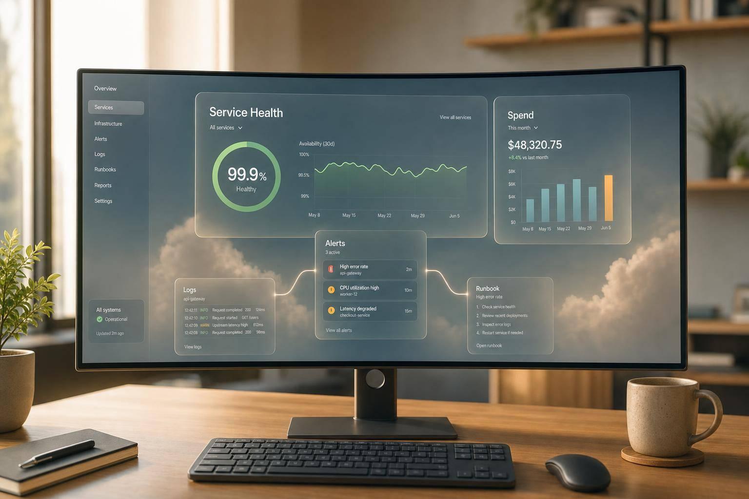
A cloud dashboard should help me make a decision in seconds - not force me to hunt through noise.
If I were setting one up today, I’d keep it tied to two things only: service health and cloud spend. That means I’d start with a plain question, pick only metrics with a clear next step, put the most urgent signals at the top, link alerts to logs, traces, and runbooks, and give each audience its own view. I’d also set an owner, a review date, and a short time window that fits the person using it - such as the last 3 hours for on-call checks, or month-to-date against a budget like £12,500.50 for leadership.
What matters most:
- I’d write the question first, then choose metrics
- I’d split dashboards by job: health, investigation, capacity, or cost
- I’d keep top-row panels for signals like SLO status, error rate, p95 latency, incidents, and spend vs budget
- I’d use alert rules with clear windows, such as p95 latency above 500 ms for five minutes
- I’d link each alert to a pre-filtered dashboard, logs, traces, and a runbook
- I’d keep one shared metric set, then show different views for on-call teams, service owners, and leadership
- I’d review dashboards monthly and again after major releases or incidents
A few numbers in the article make the point well: a dashboard can show a month-to-date spend line like £18,400 of £25,000 · 73.6% · Forecast: £26,900 for 1–22 September 2026, or a leadership view with production spend such as £48,250.75. Those figures work because they answer a direct question without extra clicks.
In short, I’d treat dashboards as working tools, not wall art: one purpose, clear ownership, direct drill-downs, and data people can act on straight away.
::: @figure 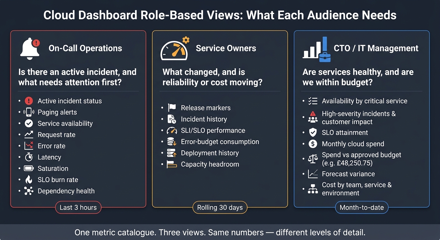 {Cloud Dashboard Role-Based Views: What Each Audience Needs}
:::
{Cloud Dashboard Role-Based Views: What Each Audience Needs}
:::
1. Plan the dashboard and choose the right metrics
Start with the operational question, then turn it into a short list of metrics. Keep only the numbers that help someone decide what to do next.
Separate service health, investigation, capacity and cost views
Each dashboard should do one job: health, investigation, capacity or cost. If you pile all four onto one page, people slow down. Ops teams, managers and leadership end up hunting for different things in the same place, and that makes response harder than it needs to be.
Choose metrics that support action
Google's Site Reliability Engineering guidance points to latency, traffic, errors and saturation as the four golden signals - a solid starting point for a user-facing service.[4] These tell you if the service is usable, under load, failing, or getting close to a resource limit.
Latency needs a bit more care. Where you can, split successful and failed requests. A fast failure and a slow success may both look like latency
, but they're not the same problem. For saturation, begin with the resource most likely to constrain the workload: CPU, memory, disk, queue depth or quota.
Beyond the golden signals, add SLO status and error-budget burn once you have a defined user journey, a measurable indicator, a target and an owner. Error-budget burn rate is especially helpful for alerting because a service can still look fine on an uptime chart while tearing through its remaining budget at speed.[3] Add deployment markers and dependency health only when they change the next step the team takes. That matters, for example, when incidents often lead back to upstream services or recent releases.
For cost dashboards, focus on metrics people can act on: spend versus budget, actual versus forecast, cost by team or environment, idle resources, commitment utilisation such as reserved instance or savings plan coverage, and unit cost. The FinOps Foundation recommends unit metrics - such as cost per request, cost per gigabyte stored or cost per token - because they tie cloud spend to real business or technical output, instead of leaving you with a total bill that's hard to use.[1][2]
Use a metric-selection table to clarify requirements
Before you lock in any metric, put it through a simple test: would someone take a clear action if this number changed? If not, cut it.
A metric-selection table makes that test concrete. The table below shows the structure teams should complete for every candidate metric. If a row can't be filled in fully, that's a sign the metric isn't ready for the dashboard.
| Dashboard question | Metric | Calculation / aggregation | Owner | Target | Alert condition | Source |
|---|---|---|---|---|---|---|
| Is checkout succeeding? | Error rate | Failed requests ÷ total requests × 100 | Platform team | Within agreed error-rate threshold | Error rate exceeds agreed threshold | APM / metrics pipeline |
| Is the service meeting its SLO? | SLO compliance | Good events ÷ valid events × 100 | Service owner | 99.9% over a rolling 30-day period[3] | Error-budget burn rate above agreed threshold[3] | SLO monitoring tool |
| Will capacity hold during peak? | CPU utilisation | Average % across instances | Infrastructure team | Agreed headroom threshold | Sustained utilisation above agreed threshold | Cloud provider metrics |
| Is monthly spend on track? | Spend vs budget | Actual spend ÷ monthly budget × 100 | FinOps / IT manager | Within budget | Forecast spend exceeds budget | Cloud billing API |
| Where is cost waste concentrated? | Idle resource spend | Cost of idle or underused resources | Team or cost-centre owner | Minimise idle spend | Material idle or underused spend is detected | Cost allocation data |
Use this table to filter out any metric that has no named owner, no target, or no clear response.
Once the metric set is fixed, place the most urgent signals first so the things that need attention stand out straight away.
2. Design the layout for fast reading and faster response
Once the metric list is set, put the most urgent signals first. A dashboard should make one thing obvious at a glance: does someone need to act now or not? That only works when the layout follows a clear pattern, not when panels land wherever the data happened to be easiest to wire up.
Put current status and budget signals in the first row
The first row is your prime screen space. Use it for SLO status, active incidents, error rate, p95 latency, request volume, and current spend versus budget. Status panels and scorecards are the best fit here. Every figure should show its unit and time window inside the panel itself. For example, write p95 latency: 420 ms, last 15 minutes instead of just 420. Add a visible threshold or target line so people can judge the number straight away, without doing mental maths.[7][9]
For spend, a panel reading Month-to-date: £18,400 of £25,000 · 73.6% · Forecast: £26,900 covering 1–22 September 2026 gives an IT manager the full picture without extra clicks.[5][6] Keep the colour scheme restrained: green for healthy, amber for warning, and red for breach. But don’t stop at colour. Pair each state with a text label such as Healthy, Warning, or Breached so the dashboard still works for people with colour-vision differences and when printed or shown in greyscale.[7]
Arrange panels in a diagnostic sequence
After the top row, lay out the rest of the dashboard in the order an operator would think through a problem: overview first, then service signals, then dependencies, then infrastructure detail, and then cost. That way, people don’t have to bounce around the page.
The second row should cover traffic, error rate, and latency percentiles - p50, p95, and p99 - over the past two hours, with SLO and warning lines on each chart. The third row should show dependency health, including database latency, queue depth, cache hit rate, and third-party API availability. The fourth row should rank affected regions, services, or resources by error count or latency in a table. That tends to be far more useful for finding the worst offenders than a wall of near-identical time-series charts. The final cost row should show the 30-day spend trend and the services or teams behind the largest forecast variance.
This sequence lets operations staff check customer impact first and root cause second. At the same time, a CTO or IT manager can scan the top row and the cost trend without digging into the lower sections.
Use:
- line charts for trends
- scorecards for current values
- ranked tables for outliers
Avoid stacked charts unless cumulative totals are what matter.
Use a layout-planning table to map each panel
Before you build anything, map every panel to a user question and a drill-down destination. That stops panels being added just because the data exists. The table below shows a practical planning structure for a production service dashboard:[8][9]
| Row or section | User question | Widget type | Time range | Filter variables | Drill-down destination |
|---|---|---|---|---|---|
| 1 - Overview | Is the service meeting its SLO, and is spend within budget? | Status panels and scorecards | 15 minutes and current billing period | Service, environment, account, team | Incident view and service overview |
| 2 - Service signals | Are traffic, errors or latency changing? | Time-series charts | 2 hours | Service, environment, region | Logs, traces and endpoint breakdown |
| 3 - Dependencies | Is a dependency causing the degradation? | Time-series charts and status panels | 2 hours | Service, dependency, region | Database, queue or third-party dashboard |
| 4 - Infrastructure | Which host, container, node or region is affected? | Ranked table and time-series charts | 2 hours | Environment, region, cluster, resource | Resource or infrastructure dashboard |
| 5 - Cost | Which services or teams drive the largest forecast variance? | Ranked table and trend chart | Billing period and 30 days | Account, team, service, region | Cost explorer or usage-report breakdown |
Use filter variables - service, environment, region, account, and team - instead of cloning the whole dashboard for every possible combination.[10][11] One dashboard set to Service = payments, Environment = production, and Region = UK South can do the same job as several static dashboards, with much less maintenance. Keep variable names and their order the same across all dashboards so users don’t have to relearn the controls every time they switch views. Store this planning table alongside the dashboard definition so each panel keeps a documented purpose.
Once the layout is fixed, link each panel to the alert, log query, or runbook it should trigger.
3. Build the dashboard and connect it to alerts and runbooks
Use the layout plan to tie each panel to live data, clear thresholds and a direct response path. In plain terms, take the panel map from the previous section and connect every widget to the right data source, trigger point and next action.
Configure data sources, thresholds and filters
Start with infrastructure metrics. Then layer in the application and business signals the team uses day to day. Keep labels consistent across metrics, logs and traces so the same filters work in every view.
Use sum for totals, max for saturation and p95/p99 for user-facing latency. Keep request IDs, customer IDs and session IDs in logs or traces instead of metric dimensions. Each panel title or subtitle should show the unit, source, time zone and aggregation.
Set thresholds around what people actually need to do. Warnings should prompt early investigation. Critical thresholds should point to sustained user impact or an imminent SLO breach. Be precise with the evaluation window. For example, use p95 latency above 500 ms for five minutes instead of alerting on one short spike. Set missing-data behaviour for each metric:
- Treat heartbeat gaps as failures
- Treat event-driven silence as non-breaching
- Ignore short-term collection gaps
Link every alert to investigation context
Once the panels are live, connect each alert to the same service, environment and region filters. Every alert should link to the pre-filtered dashboard, the relevant log query, the trace view and the runbook, all scoped to the alert window.
The runbook should follow a short path: confirm the alert, check the dashboard and logs, inspect recent deployments, identify likely dependencies, apply approved mitigation, verify recovery and document the outcome. Route warnings to a team channel or ticket queue. Route critical alerts to the on-call system, with an escalation path if they stay unresolved after a set period.
Before turning on any alert in production, test it end to end. Trigger a controlled breach, confirm the alert evaluates after the planned number of periods, open the notification link, and check that logs, traces and the runbook all point to the right service and time window. Test recovery too, not just firing.
Manage dashboards as code
Store every dashboard definition, alert rule, notification policy and runbook reference in version control alongside the related service or infrastructure configuration. Any change to a query, threshold, label, unit or escalation route should go through pull-request review.
Add automated checks to the deployment pipeline for invalid queries, missing owner labels, broken runbook links and panels that point to deleted metrics. Record the reason for each change in the commit history.
4. Create role-based views and keep dashboards accurate over time
Build separate views for operations, service owners and leadership
Once you've set the core dashboard, split it into role-based views without changing the metric definitions underneath.
Start with one metric catalogue: one definition each for availability, latency, incident severity and production spend. After that, give each audience only the slice it needs. That way, operations, service owners and leadership all work from the same numbers, just at different levels of detail.
| Audience | Primary question | Core dashboard content |
|---|---|---|
| On-call operations | Is there an active incident, and what needs attention first? | Active incident status, paging alerts, service availability, request rate, error rate, latency, saturation, SLO burn rate and dependency health |
| Service owners | What changed, and is reliability or cost moving? | Release markers, incident history, SLI/SLO performance, error-budget consumption, deployment history, capacity headroom |
| CTO / IT management | Are services healthy, and are we within budget? | Availability by critical service, high-severity incidents and customer impact, SLO attainment, monthly cloud spend, spend versus approved budget, forecast variance, cost by team, service and environment |
For leadership dashboards, keep the first row tight. Show decision signals only: current availability, major incidents, month-to-date spend in pounds sterling, for example £48,250.75, budget variance and forecast variance.
Control access, naming and review processes
Use the same metric set, then control who can view and change each dashboard for each audience.
Least privilege is the right default. Most people should get read-only access, while named maintainers handle edits. Use SSO and group-based permissions where you can. Keep read, edit and administration permissions separate. And don't use public links for dashboards that show internal topology, financial data or security details.
Each dashboard should include ownership metadata: owner, backup owner, technical contact, data sources, last validation date and escalation route. Use a naming pattern such as Payments / Production / Operations or Payments / Leadership / Monthly, and sort dashboards into folders by audience and environment.
Treat stale or broken dashboard data as a reliability issue. Bad numbers can throw incident response off course just as much as a missing alert.[12] Set reviews after every major release or major incident, check monthly for stale panels and broken queries, and recheck quarterly to make sure thresholds still match current SLOs, capacity and budgets.
Conclusion: Keep dashboards tied to action, service health and spend
The logic across this guide stays the same: define the decision first, pick metrics that support it, design for quick reading, connect each alert to investigation context and a runbook, and keep role-based views in good shape over time.
Dashboards drift when no clear question sits behind them, or when no named owner is responsible. Panels go stale. Thresholds stop matching reality. Teams stop trusting what they're looking at.
If an organisation needs to connect cloud operations data with automation, AI agents or broader DevOps transformation, Hokstad Consulting may be relevant because it provides AI strategy and implementation services alongside DevOps transformation, custom development and automation.
FAQs
How many metrics should one dashboard include?
There’s no set number of metrics a dashboard has to include. The better approach is to focus on the metrics that matter most to your organisation and the people who rely on the dashboard.
To keep it easy to use, place critical, high-level metrics at the top, service-specific data in the middle, and more detailed breakdowns at the bottom. It helps to group related metrics together too, so people can scan the dashboard fast without feeling swamped.
What should be in a dashboard runbook?
A dashboard runbook should be a practical guide that helps responders assess and fix issues fast.
Include the affected server or service, current usage levels, links to the right dashboards and logs, and clear escalation steps for critical alerts that no one picks up. That gives teams the context they need to act straight away and make sound decisions under pressure.
How often should cloud dashboards be reviewed?
Review cloud dashboards on a regular basis so they stay useful and tied to what the business cares about now, not what it cared about six months ago.
Audit general metrics dashboards at least once per quarter. That gives you a clear chance to remove old data, trim views that no longer matter, and keep reporting lined up with business goals.
Alert configurations need a closer rhythm. Review those monthly so teams don’t end up chasing noisy alerts or missing issues that matter. It also helps to audit tagging strategies and resource allocations from time to time to avoid data errors creeping into your reporting.
These check-ins keep dashboards in step with changing business needs and help them keep delivering strategic value.